
SDK Configuration Properties
Refer various SDK config properties applicable for Unity integration
SDK Configuration Properties
SDK configuration parameters
Unity WebAR sdk package allows user to handle the behavior of the sdk by configuring the different parameters
To customize the sdk properties open blippar settings and go to the inspector tab.

auto init
Description
When SDK and unity components with webar-* attributes are loaded, the AR experience starts automatically by default. In case the AR experience has to be started only after an event or user intervention, then auto-init attribute can be set to "false".
Note: If auto-init="false" is assigned, the WEBARSDK.Init() method has to be called to start the WebAR experience. Please note that auto-init is associated with initializing the sdk core whereas auto-start enables the user to control when to start the tracking in the app.
auto start
Description
When sdk and unity components with webar-* attributes are loaded, the AR experience starts automatically by default. In case the AR experience has to be started only after an event or user intervention, then the auto-start attribute can be set to "false".
Note: If auto-start="false" is assigned, the WEBARSDK.StartTracking() method has to be called to start the WebAR experience/tracking. Please note that auto-init is associated with initializing the sdk core whereas auto-start enables the user to control when to start the tracking in the app.
set auto scale
Description
Auto Scale is enabled by default. To disable the auto scale, pass boolean 'false' in the argument and call this function after Init(). What is Auto Scaling in context of 'Marker Tracking' & 'Surface Tracking'? Marker Tracking:The scaling is applied in such a way that a (1,1) unit plane fits the width/height of the marker(where unit is meter). Surface Tracking:It scales the AR object based on distance from the camera

auto marker detection
Description
It enables auto marker detection so that user doesn't have to manually click the scan button, rather it detects automatically when it recognises a marker.
Note: If auto-marker-detection="true" is assigned, the scan button disappears from the phone screen during marker tracking and it starts scanning automatically.

enable photo ui
Description
Capturing screenshots in a Unity web application involves capturing the current state of the application's viewport and saving it as an image file. This can be useful for various purposes, such as sharing gameplay moments, creating documentation, or debugging.
"Enable Photo UI" parameter allows you to show/hide the screenshot button state, to show the button just check the Enable Photo UI button and uncheck for hide.
render scene on desktop
Description
To enable/disable the rendering of the 3D scene on the desktop without any tracking. When the value is set to "true", the 3D scene is rendered as seen by the default virtual camera on the desktop browser (without tracking). When set to "false", the default qr code page is displayed on the desktop browser. Default value is "false".

show qr code on desktop
Description
To show/hide a "Try on Mobile" button displayed on the desktop browser. On clicking this button, it shows the QR code which can be scaned from the mobile device to load the application. This can be useful when render-scene-on-desktop attribute is set to "true". Default value is "false".
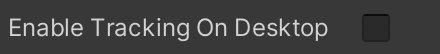
enable tracking on desktop
Description
To enable/disable tracking on the desktop browser. This will be useful while developing the marker tracking application on the desktop itself. It also works with the developer console's mobile simulator in Chrome desktop browser. Right now only Marker tracking is supported on the desktop browser. When set to "false", tracking is disabled on the desktop browser and the default qr code page is seen. When set to "true", tracking is enabled on the desktop browser and the camera view is seen. Default value is "false". Also by default the camera view displayed is a mirrored image of the real world. To enable/disable this mirroring see enable-mirroring-on-desktop attribute for more details.
enable mirroring on desktop
Description
To enable/disable mirroring of the camera view displayed on the desktop browser when enable-tracking-on-desktop is set to "true". When set to "false", mirroring of the camera view is disabled on the desktop browser. When set to "true", mirroring of the camera view is enabled on the desktop browser. Default value is "true".

Hide Reset Button
Description
The Hide Reset Button attribute allows developers to control the visibility of a reset button within the AR interface. When set to true, this attribute hides or removes the reset button from the user interface, streamlining the experience by eliminating unnecessary elements. This can be particularly useful if the reset functionality is not required or if you wish to manage state resets through custom controls or interactions.
Example

Tap And Place
Description
Tap And Place: true a visual cursor appears on the identified surface within the AR scene. Users can tap the screen to place the 3D model at the cursor's location, providing an intuitive way to control where the model appears in the physical environment. Conversely, setting Tap And Place: false will hide the cursor, disabling this placement feature and the 3D model will appear on the surface after detection.
Example

Loading screen parameters
WebAR SDK loading screen can be configured to customize the logo, style of the splash screen, UI screens (shown by SDK) etc using the following SDK configuration parameters.
Blippar Unity SDK package allows you to customize your API. There are several SDK attributes that you can define for customization. This API can be applied for customizing the loading screen animation to display any logo image, size, colour, progress ring, ring colour instead of displaying the default loading screen. For example: and many more.
To customize the loading screen animation follow the steps below:
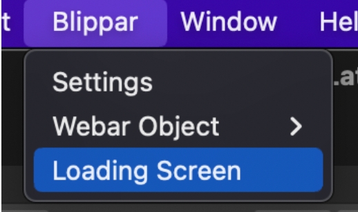
Click on the 'Blippar' Menu tab and from the drop-down, select the option 'Loading Screen'.
The loading screen tab will be displayed on the screen
A default template will be selected as the template that would be used for generating the build.
You can use the default template as a base and modify to create new templates. You can also choose to create as many templates as required.
Provide the name of the logo and store the required assets into the Assets/WEBGLTemplates/Blippar/images. This is the folder location in which the image files must be stored in order to effectively trigger the customized animation.
Enter the details of customization for logo width, height, progress dot ring scale, ring colour, alert border colour etc based on your requirement.
Click on 'Save Template' to save the modified as the default. You can alternatively select the option to 'Save as new Template'. Refer image below:

logo name
Description
Changes the circular logo in the loading splash screen.

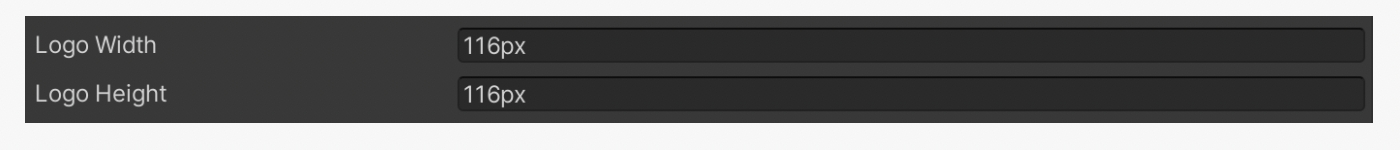
logo width / logo height
Description
Changes the width and height of the circular logo in the loading splash screen.
progress dot ring scale
Description
Changes the size/scale of the dotted loading ring which runs indefinitely until the splash screen disappears.

progress dot ring color
Description
Changes the color of the dotted loading ring which runs indefinitely until the splash screen disappears.

progress ring scale
Description
Changes the size of the loading progress update ring.

progress ring color
Descriptiona
Changes the color of the loading progress update ring.

progress ring line width
Description
Changes the thickness of the loading progress update ring.

loading progress type
Description
"default" or "circular" - Default loading screen, loads the experience and shows in numeric format. Circular progress bar shows a loading circular ring.

alert border color
Description
On iOS Safari browser, a Camera permission request notice is displayed before asking the user to allow access to the Camera. This attribute changes the border color of the notice alert dialog.

alert border width
Description
On iOS Safari browser, a Camera permission request notice is displayed before asking the user to allow access to the Camera. This attribute changes the border thickness of the notice alert dialog.

alert border radius
Description
On iOS Safari browser, a Camera permission request notice is displayed before asking the user to allow access to the Camera. This attribute changes the border radius of the notice alert dialog.

alert background color
Description
On iOS Safari browser, a Camera permission request notice is displayed before asking the user to allow access to the Camera. This attribute changes the background color of the notice alert dialog.

alert message text color
Description
On iOS Safari browser, a Camera permission request notice is displayed before asking the user to allow access to the Camera. This attribute changes the text color in the notice alert dialog.

alert button color
Description
On iOS Safari browser, a Camera permission request notice is displayed before asking the user to allow access to the Camera. This attribute changes the button color in the notice alert dialog.

alert button text color
Description
On iOS Safari browser, a Camera permission request notice is displayed before asking the user to allow access to the Camera. This attribute changes the button text color in the notice alert dialog.

alert button height
Description
On iOS Safari browser, a Camera permission request notice is displayed before asking the user to allow access to the Camera. This attribute changes the button height in the notice alert dialog.

alert button border radiust
Description
On iOS Safari browser, a Camera permission request notice is displayed before asking the user to allow access to the Camera. This attribute changes the border radius of the OK button in the notice alert dialog.

alert camera permission text
Description
On iOS Safari browser, a Camera permission request notice is displayed before asking the user to allow access to the Camera. This attribute changes the camera permission text in the notice alert dialog.

alert camera permission button text
Description
On iOS Safari browser, a Camera permission request notice is displayed before asking the user to allow access to the Camera. This attribute changes the camera permission button text in the notice alert dialog.

alert motion permission text
Description
On iOS Safari browser, a Camera permission request notice is displayed before asking the user to allow access to the Camera. This attribute changes the motion sensor permission text in the notice alert dialog.

alert motion permission button text
Description
On iOS Safari browser, a Camera permission request notice is displayed before asking the user to allow access to the Camera. This attribute changes the motion sensor permission button text in the notice alert dialog.

ui background color
Description
Changes the background color of the loading splash screen, landscape warning screen or any device/server communication error.

ui text color
Description
Changes the text color of the landscape warning screen, or any device/server communication error.

desktop logo
Description
Changes the logo image displayed in a desktop browser where the user is asked to scan the QR code or type the url in Android or iOS mobile browsers.

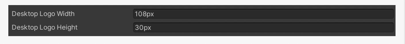
desktop logo width / desktop logo height
Description
Changes the width and height of the logo image displayed in a desktop browser where the user is asked to scan the QR code or type the url in Android or iOS mobile browsers.
issue img
Description
Changes the warning symbol image displayed in the landscape warning screen, or any device/server communication error.

issue img width / issue img height
Description
Changes the width and height of the warning symbol image displayed in the landscape warning screen, or any device/server communication error.

tracking animation url
Description
Navigate to the 'Tracking Animation URL' field and provide the animation url https://lottiefiles.com/. If url is empty then sdk will play default animation for tracking

auto scan instruction
Description
User can change the default scan instruction for auto marker detection, i.e. when_auto-marker-detection_ sets to 'true'.

auto-scan-instruction-detect
Description
User can change the default scan instruction when marker is detecting i.e. recognises a marker image.

auto scan instruction idle
Description
User can change the default scan instruction when phone is idle

auto scan instruction text style
Description
Changes the css style of scan instruction text element.

auto scan style display
Description
User can change the display style of auto scan html element

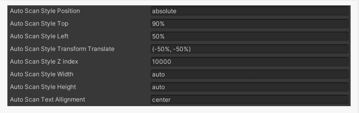
auto scan style
Description
User can change css style of scan instruction html element.
scan button display
Description
Changes the css display property of the scan button displayed during marker tracking i.e. when webar-mode="marker-tracking". To make it invisible set it to"none"else"block".

scan button height/ scan button width
Description
Changes the height and width of the scan button displayed during marker tracking i.e. when webar-mode="marker-tracking".

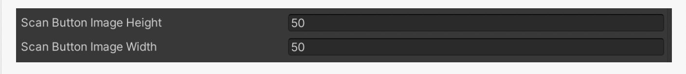
scan button img height / scan button img width
Description
Sets the height and width of the image displayed in the scan button displayed during marker tracking i.e. when webar-mode="marker-tracking".
scan button img
Description
Sets the image of the scan button displayed during marker tracking i.e. when webar-mode="marker-tracking".

scan button img transform
Description
Sets the SVG transform property (e.g. translate(), rotate() etc.) of the image displayed in the scan button displayed during marker tracking i.e. when webar-mode="marker-tracking".

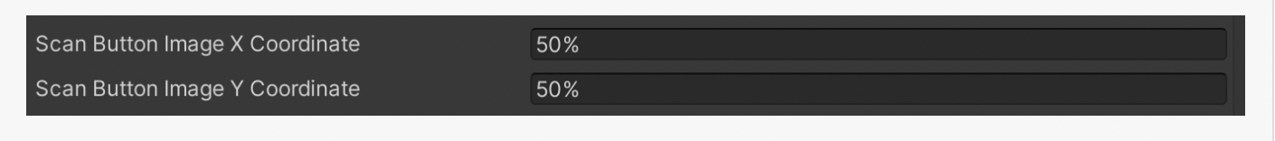
scan button img x coordinate / scan button img y coordinate
Description
Sets the x and y coordinates of the image displayed in the scan button during marker tracking i.e. when webar-mode="marker-tracking". The x and y position of the image is the top left position, relative to the viewport of the origin of the element i.e the scan button. Use scan-btn-img-transform attribute's translate() method to position the image to the centre.
scan button instruction
Description
Changes the text below the scan button displayed during marker tracking i.e. when webar-mode="marker-tracking".

scan button instruction style
Description
Changes the css style of the text below the scan button displayed during marker tracking i.e. when webar-mode="marker-tracking".

scan button progress bar color
Description
Sets the color of the progress foreground circular bar displayed around the scan button during marker tracking i.e. when webar-mode="marker-tracking".

scan button progress bar cx coordinate/scan button progress bar cy coordinate
Description
Sets the x and y coordinates of the centre of the progress foreground circular bar displayed around the scan button during marker tracking i.e. when webar-mode="marker-tracking".

scan button progress bar radius
Description
Sets the radius of the progress foreground circular bar displayed around the scan button during marker tracking i.e. when webar-mode="marker-tracking".

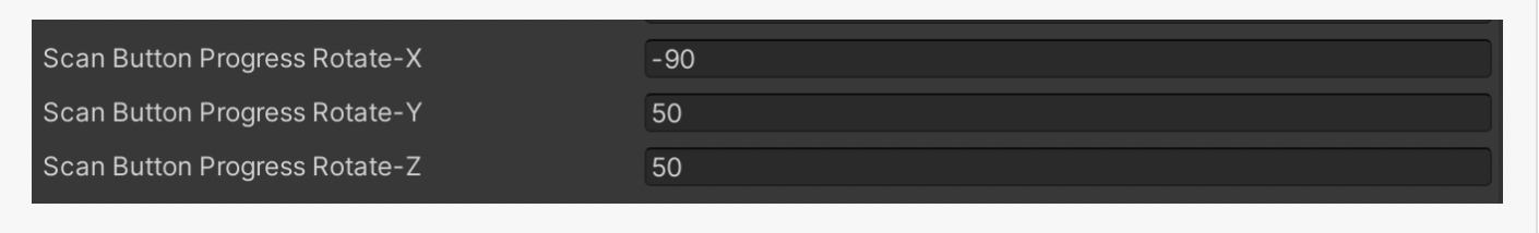
scan button progress bar transform rotate
Description
Sets the SVG transform property (e.g. translate(), rotate() etc.) of the progress foreground circular bar displayed around the scan button during marker tracking i.e. when webar-mode="marker-tracking".
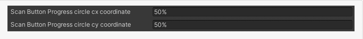
scan button progress circle cx coordinate/scan button progress circle cy coordinate
Description
Sets the x and y coordinates of the centre point of the progress background circle displayed around the scan button during marker tracking i.e. when webar-mode="marker-tracking".
scan button progress circle radius
Description
Sets the radius of the progress background circle displayed around the scan button during marker tracking i.e. when webar-mode="marker-tracking".

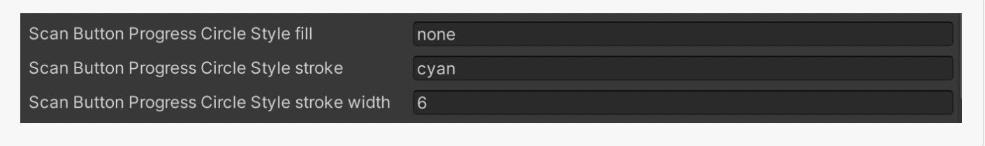
scan button progress circle style
Description
Sets the SVG style of the progress background circle displayed around the scan button during marker tracking i.e. when webar-mode="marker-tracking".
ios camera permission
Description
To enable/disable the camera permission alert dialog(generated by the sdk) on iPhone devices before showing the iOS system request to access the camera. When set to "false", A Camera and Motion permission alert is shown only during the first time the application is loaded on the browser. When set to "true", A Camera and Motion permission alert is shown during the first time the application is loaded on the browser. After that for every load, only the Camera alert is shown. The advantage of showing the camera permission alert during every load is to start the auto playback of the video(if any) in the AR experience. In iOS Safari browser, a video cannot be played automatically when the scene is loaded. Instead it has to be played only after a user interaction. With this camera alert interaction, the app can start and pause the AR scene videos (using the callback from SetCameraAlertCallback() API) and also starts the iOS system alert to access the camera. Once the tracking has started, the paused videos can be played programatically to look like it is auto-played. The default value of this attribute is "true".

auto scan instruction idle on desktop
Description
User can change the default scan instruction when desktop camera view is idle i.e no valid marker is detected. If no valid marker is detected within 5 minutes, user has to reload the page to start detection to work again.
Note: Default text for idle instruction is "Reload to detect a marker"
